
8 Steps to integrate Sagemaker models with Quicksight
Integrate Amazon SageMaker models with Amazon QuickSight for predictive analytics. Install, configure and create a dynamic dashboard to improve customer satisfaction and reduce churn.
In today’s data-driven world, combining machine learning with business intelligence enables deeper insights and predictive capabilities. This post explains how to integrate a machine learning model built in Amazon SageMaker Canvas into Amazon QuickSight for predictive analytics.
We’ll use a common business case – predicting customer churn. Using a dataset of 10,000 bank customers, we built a SageMaker Canvas model to predict the probability that a customer will close their account (the target variable “Exited”).
Table of Contents
Step 1: Initiating the process
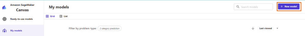
First, open Sagemaker Canvas and go to the “my models” section. Here, select the “new model” option to start the process.
Step 2: Naming and setting up your model
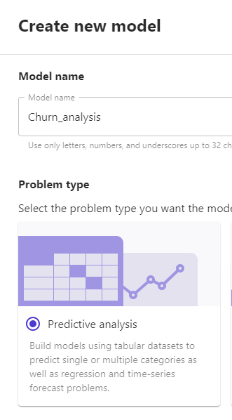
Following this, it’s important to assign your model an identifiable name that aligns with your objectives. Select “predictive analysis” as the model type, focusing on the goal to predict customer churn.
Step 3: Data Upload or Integration
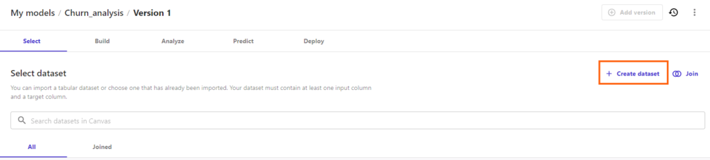
The next step involves creating a new dataset. You’ll need to upload or connect the model to the relevant data, which can be a file on your computer or data from an online source.
Step 4: Configuring the Model
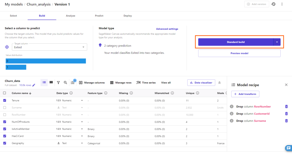
Once your data is uploaded, it’s time to specify the “target column.” In our case, it’s “Exited,” which represents customers who have left the bank. It’s also important to exclude any columns with irrelevant information, such as row numbers, customer IDs, and surnames, to ensure the analysis is focused and relevant.
After setting this up, start the ‘Standard build’ process. The duration of this process will depend on your model’s complexity.
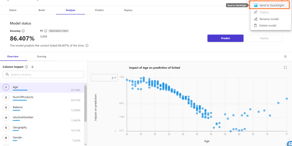
Step 5: Result Overview and Preparation for Further Analysis
When your model is complete, you’ll be presented with a summary of the results. To continue, select “Send to Quicksight” from the options in the top right corner. This action will download a JSON file to your system, which you will need for subsequent steps.
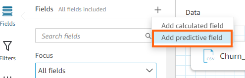
Step 6: Creating a New Analysis in Quicksight
Now, move to Quicksight and begin a new analysis. Choose the dataset on which you want to predict (this could be a CSV file, data from Salesforce, S3, PostgreSQL, etc.). Start by editing the dataset and then choose “Add predictive field.”
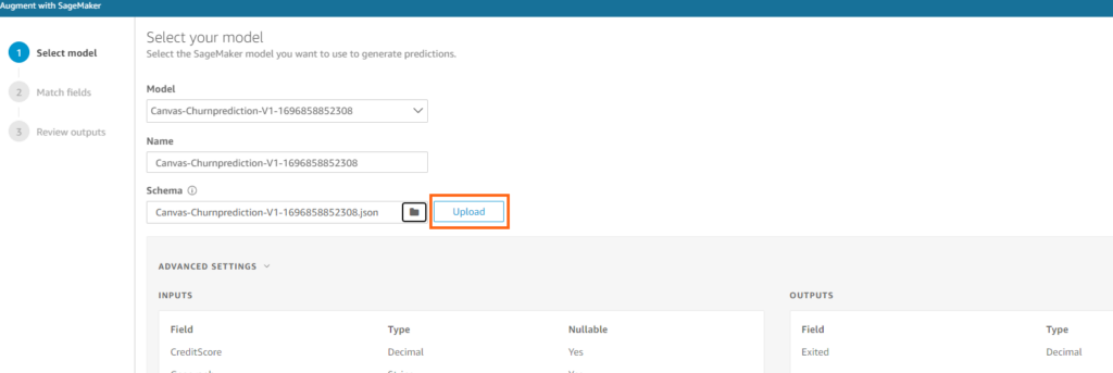
Step 7: Integrating the Predictive Model
In the “model” section, your data visualization tool will display the model sent from your predictive analysis platform. Upload the previously downloaded JSON file in the “schema” section. A new column, representing your churn predictions, will now be included in your dataset.
Step 8: Developing a Dynamic Dashboard
The final step is to create a dashboard using the enriched data. This dashboard will update with new predictions each time it’s refreshed with new data, providing continuous insight into customer behavior.
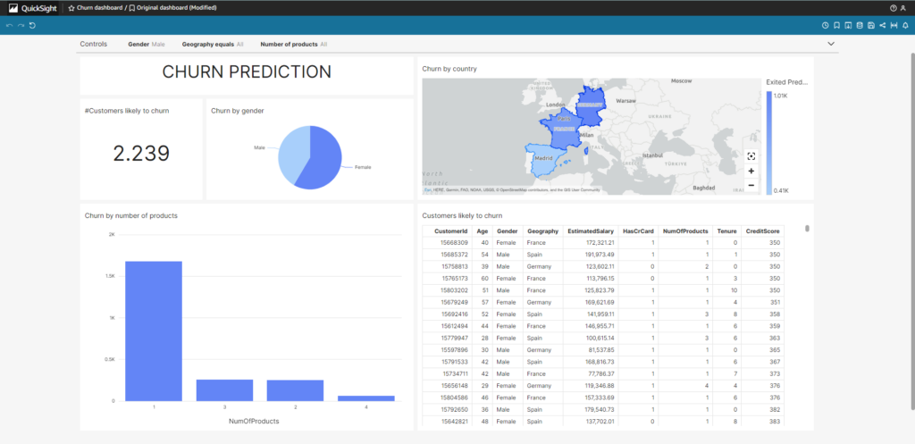
Utilizing predictive dashboards is a strategic move for sales teams, providing them with data-driven insights to formulate targeted customer retention strategies. The integration of robust predictive models with comprehensive data visualization tools allows businesses to proactively enhance customer satisfaction and loyalty, ultimately reducing churn.
Creating value through predictive analytics: Nucleoo’s vision
In this article, we have explored the powerful synergy between artificial intelligence, data analytics and business strategies, and how these tools can drive business transformation and value creation. At Nucleoo, as business platform experts, we are committed to providing a strategic and professional approach for each client, tailoring a broad set of technologies, including AI and data, to their specific needs. Our mission is to help businesses positively impact and evolve in an increasingly digital world. If this article has piqued your interest and you would like to discover how your company can make the most of these technologies, please do not hesitate to contact us. We are here to help you drive your business success.